Of course the past few weeks I've been busy collecting inspiration photos of children's rooms. So I thought I might go ahead and post a round-up of some of my favorite rooms: first girls' and then boys' (which, I'll admit, where a lot harder to find!). [Aside: And no, I still don't know what I'm having, but I should when I go to the doctor next on the 20th!] This first room from Natasha Baradaran (whom I only recently discovered but very much love) is a great way to kick this post off. I love the melon and yellow color scheme -- and that butterfly fabric is pretty dynamite. Overall, this is a kid's room that doesn't feel particularly kiddish, but also doesn't feel too adult. It's that delicate balance that I think is so difficult...and that I'd argue all these rooms have in common.

Another Natasha Baradaran room, this time in a lovely lilac and sage. The palette is very soothing and feels a bit Provencal to me. I love how natural this room feels, too, with the nubby natural headboard and very clean and simply white fabric draped around the bed.
Jeff AndrewsI just realized this is the only nursery I've featured on this roundup -- but frankly in many of these rooms you could just swap out a bed for a crib and pretty much be there, yes? In any case, I love how there are two gliders in this room. Perfect for your spouse or friend to keep you company while you nurse. I also love how the shaggy green rug looks almost like turf -- it brings a naturalness to the room that's a great counterpoint to all that pink and yellow. My only complaint? Those yellow sheers! They just look dirty to me.
I'll admit I'm a bit jealous of that girl -- her bedroom is pretty darn fabulous! The headboard is sophisticated and neutral, a piece that could easily see her well into her adult life. The large-scale square and circle print doesn't feel overwhelming thanks to heavy doses of white (and keeping the wallpaper to just one feature wall). Oh yeah, and at her age I would've killed to "play" on a pink guitar!
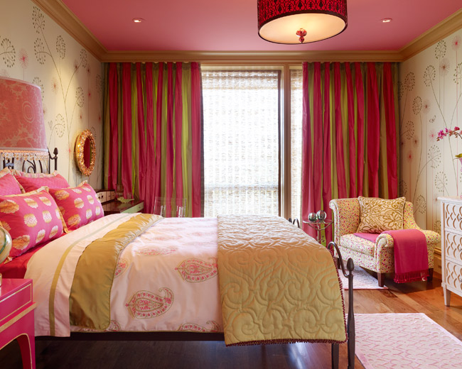
This room is a personal favorite of mine (in fact, I posted on it at length
HERE). The colors, the prints, the furniture...it's just all so fun and funky! The wallpaper is particularly fabulous, especially with the pink ceiling and gold crown molding. Fit for a princess, indeed.
A second example of how to use this great, graphic print, this time used more sparingly in just the drapes. I think though my favorite element in here is the daybed-cum-hammock. What a great spot for daydreaming, reading and gossiping!
I include this room primarily because I am completely in love with that headboard. Note how the greek key motif is again picked up on the carpeting.
This room sure made the rounds in the design blogosphere a few months ago, but it's too great not to include in this roundup. I love how the bed/bookshelves combo are completely built-in. It's a tremendous use of a very small space. The pops of pink and turquoise make a big impact and I love the sophisticated use of a chinoiserie; it's pretty and feminine, but not babyish.
As a little girl I had a strong affinity for Impressionist art, especially anything by Claude Monet. And there's something about this room that reminds me of him. The soft colors and prints almost bleed into each other, creating a soothing, pretty picture. I also love the flatweave striped rug -- a brilliant choice in any kids' room for hiding all manner of sins.

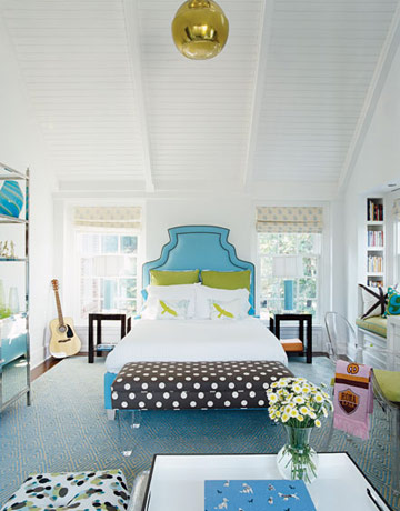
As a woman who doesn't consider herself overtly girly, I can definitely appreciate a girl's room that doesn't have an ounce of pink in sight, but still strikes a decidedly feminine note. The turquoise, chocolate brown and white combination is exceedingly popular -- you need only look at PB Teen to see that, but I really love how Sally brought in hits of chartreuse to bring an extra dimension and real jolt of novelty to the space. Note how the spotted print on the floor cushion brings the entire color palette together. Sometimes an inspiration print doesn't have to be the dominant print to be the spring board for the entire look.
P.S. - Those bedlinens are purportedly by Kate Spade? When did Kate get into linens? Is she still doing them?

Did y'all catch the first season of Nine by Design on Bravo last winter? While I'm not wholly in love with most of the Sixx Design portfolio, after catching that show I am now very much in love with the darling family behind Sixx Design. Of the few rooms of theirs that I do love, their twin daughters' bedroom has to be near the top. Perhaps it's that dreamy antique bed or the giant art installation of fake flowers behind plexi-glass, but there's just something so joyous, feminine and yet very clear and modern about this space. It's a great dichotomy that makes for a very refreshing girl's bedroom.
And finally, what roundup of little girls' rooms would be complete without a collection of fantastic canopied daybeds?
A great modern approach with a sharply tailored canopy and graphic geometric print.
Ruthie Sommers goes the more traditional route with lots and LOTS of pink. The blue and white porcelain table lamp is a great touch and really helps to break up the monochromatic room.
Perhaps my favorite version of this look -- the floral print has a great color palette and a more graphic, whimsical touch. Love how the inside is lined in a solid -- it really helps break up all the pattern.
I love purple in a girls' room and the touch of zebra in the canopy lining brings a more grown-up look that's perfect for a preteen or teen.


No comments:
Post a Comment