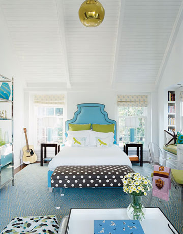
I think that Lucite (or clear acrylic) is a bit of a tricky element in the design world. Sure, it's fun and irreverent, but it can also veer all too easily into seriously tacky territory (see also, stripper shoes). But, like most other things in design (both interior design and in fashion) it's really all about context. Put Lucite in the right setting and it can be wildly successful (see also, Prada, Michael Kors), but pair it with too much animal print, patent leather and uplights, and you've suddenly found yourself in some terrible '80s flashback.
So how then, can you get it right? While my advice for fashion is pretty simple (keep the rest of your outfit relatively conservative, and keep the Lucite confined to a (preferably lower and chunkier) heel, I think it's worth delving into the question in a bit more detail when it comes to design.
As with a single outfit, it's best to keep your Lucite pieces in a single room to a minimum. Just as you wouldn't want every hard surface in your room in the same, dark wood, so too do you want to eschew matching your Lucite coffee table to your Lucite side table to your Lucite lamp....you get the idea. Keeping your Lucite pieces to only one or two standouts allows them to be the stars that they are. Here, DC-based designer Sally Steponkus successfully incorporates a Lucite coffee table into an otherwise fairly formal, traditional living room. The Lucite injects a youthful, more lighthearted note.

Lonny
There are a ton of wonderful examples of designers incorporating acrylic coffee tables into their designs available on the web to inspire you. I particularly love using an acrylic coffee table when the room is tight on space as it almost disappears, avoiding that cluttered/cramped look I generally dislike. Like glass or mirrors, Lucite is a great material to use when you want to add function, without taking up any visual space.

A pair of small acrylic side tables work beautifully as a single coffee table, allowing an uninterrupted view of a particularly striking rug while the two smaller tables give you maximum flexibility to move them around when entertaining.

Leslie Klotz via House Beautiful
The shape of this coffee table is particularly stunning, but its clear base means it doesn't compete with the bold fabric choices on the bench, club chair and pillows.

Ken Fulk
Another great example of how Lucite works particularly well when you don't want to lose sight of a particularly striking rug. I also love the tension in this room between the thoroughly modern coffee table and zebra hide against the much more traditional moldings and upholstered pieces.
I'm so charmed by the idea of a Lucite trunk. The visual joke of having closed storage be completely transparent strikes me as particularly fresh. I'd do as this homeowner did here and fill it with my favorite books and/or magazines.
Of course tables aren't the only place where Lucite is welcome. Lucite seating can also be incredibly attractive. I love these Lucite barstools, with their upholstered seats and I think they work particularly well in this more traditional kitchen. If you're looking for a similar look, you could always add an upholstered seat to these Kartell charles ghost stools.
Jamie Drake
I don't think you can ever go wrong with an acrylic chair for your desk. It's practically foolproof, though I do think it's best to pair these chairs with more traditional tables and desks. Remember: it's contrast that creates interest!
Having said that though, I do think a Louis ghost chair from Phillipp Starck works beautifully with a clean-lined Parsons desk. But then again, they're both design classics.

I love the combination of these very modern Lucite chairs with their more traditional, tufted seats. The clear acrylic further lightens the sunny yellow walls and are great counterpoints to the very traditional wood pedestal table.

Christina Murphy
The mademoiselle chairs from Kartell are some of my favorites (I particularly love them in Missoni prints). They work perfectly with this dining room's glamorous, highly reflective atmosphere and add a sense of weightlessness to the heavy round pedestal table and dark wood floors. Can you imagine how boring this room would look with more traditional dark wood dining chairs?
I love a set of Lucite legs peaking out from underneath a bench or chair. This is a great way to incorporate a little bit -- but not too much -- acrylic into a design or when you simply want a fantastic print or shape to dominate. Note too in this room how there's also a Louis ghost chair from Phillipp Starck used as a desk chair: I think multiple Lucite pieces work in this space because it's young and fun and because they're really not the dominate players here (the fabrics are).

I love the idea of a Lucite headboard when you want the stability of a headboard without blocking any of the wall behind it (perhaps because, as shown above, you have particularly a fantastic wallpaper or mural). Sure, you could forgo a headboard altogether, but I do think that creates a very modern look that can even look a bit unfinished (and, as an avid reader in bed, I personally just don't find a total lack of headboard to be particularly comfortable). This trick would also be very effective when you are placing your bed in front of a window.
If you're looking for a few good sources of Lucite and other acrylic pieces online, here are my suggestions on good places to get you started:
CB2 (for occasional tables and desk accessories) Plexi-craft (for just about any Lucite/acrylic furniture you can imagine)
So what are your thoughts on Lucite and acrylic furniture? Do you have any pieces in your own home?


No comments:
Post a Comment